Motion that earns its frame rate.
Six techniques, running live. Under each: what it costs, and when I would tell you not to use it.
- Frame sequence
- 90 frames · 1.05 MB1,049,581 bytes of 960 × 540 achromatic JPEG. Mean 11,662 bytes per frame; largest 16,736 at frame 003, smallest 8,878 at frame 001.
- WebGL library
- 603 KB · 149 KB gzippedthree.js r128, self-hosted: 603,445 bytes on disk, 148,742 gzipped. Fetched only when the device qualifies — on a phone it is never requested.
- Typefaces
- 4 files · 146.5 KBFraunces roman and italic, Inter, JetBrains Mono — 146,532 bytes of woff2. Self-hosted, zero third-party requests.
KB and MB here are 1,000 and 1,000,000 bytes. Raw byte counts are printed alongside so you can check them against the files. Not in the table above, because it is charged to every visitor rather than to a qualifying one: four static poster frames, 48,972 bytes, fetched unconditionally. On a device that does qualify they are four of the ninety the sequence pulls anyway, so there they add nothing.
Six specimens
Each one is a working implementation, not an illustration of one. Where a technique is too expensive for your device, this page does not load it — it shows you a designed still and tells you what it skipped.
This is the workshop where Glass Floor Studio proves its motion is real — and honest about what it costs you. Every technique here ships inside a real, flat-priced package: The Signature Site $4,800, The Booking Block $5,400, The Quote Forge $5,800, The Order Kitchen $6,900. Not sure which (if any) you need? That conversation is free.
- 01Scroll-scrubbed frame sequence90 frames · 1.05 MB
- 02Blend-mode compositing1 CSS property
- 03SVG mask knockout961 bytes of SVG
- 04Cursor-tracked 3D149 KB gzipped
- 05Scroll-pinned transitionno library
- 06Reveal choreography & magnetic hover3,315 bytes of script
§ 01
Scroll-scrubbed frame sequence
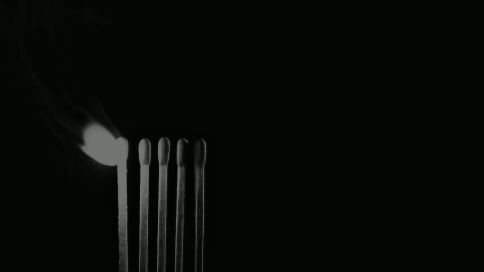
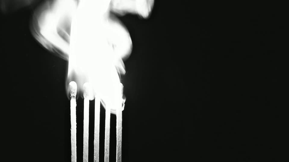
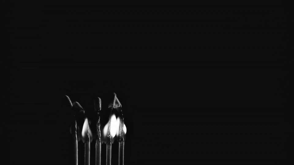
Ninety stills of a real match strike, decoded into memory, then drawn to a canvas at whatever index your scroll position maps to. You are not watching a video. You are scrubbing a timeline with the scrollbar, and it stops exactly where you stop.
Decoding 90 frames
Static poster — frame 008, the brightest of the ninety. The other 89 were not requested on this device; see “What it costs” below for exactly what was.
- What it is
- Ninety numbered JPEGs preloaded into
Imageobjects, then blitted to a<canvas>sized bydevicePixelRatio. Scroll position inside a pinned section maps to a frame index; drawing happens insiderequestAnimationFrame, never in the scroll handler, and only when the target index actually changed. On a still scrollbar this costs zero draws. - Why not a video
- This is the whole reason the technique exists. Setting
video.currentTimeseeks to the nearest keyframe, then decodes forward to the requested time. Scrub it and the picture holds, jumps, holds — the exact stutter you were trying to buy your way out of. A frame sequence has no keyframes. Every index is an exact, independent picture, so a one-pixel scroll produces a one-frame change. - What it costs
- 1.05 MB over the wire for these 90 frames — 1,049,581 bytes, counted off the files. The number that actually matters is the decoded one: 960 × 540 × 4 bytes is 2.07 MB of bitmap per frame, so roughly 187 MB of RAM if the browser keeps all ninety uncompressed. That is why the sequence is never requested below 820 px or under reduced-motion. Being exact about what that does and does not cover, because an earlier draft of this note was not: the sequence is skipped, but four static poster frames are fetched on every device, always — 48,972 bytes for the four of them. So this page does fetch frames on a phone. Four, and they are the pictures you are looking at. They are members of the same ninety, so on a device that qualifies the browser already has them and they add nothing on top.
- Build cost
- Estimate: half a day if usable footage already exists. Two to three days if it has to be sourced or commissioned, then graded and conformed first — and the footage, not the code, is where that time goes.
- When not to use it
- Anywhere the visitor needs to read while scrolling, because pinning takes the scrollbar away for the length of the section. Once per page, never above the thing you actually want them to do, and never on a phone — and this page itself breaks the once-per-page part, which specimen 05 owns up to with the numbers. If the arc of the footage is not legible in ninety frames, it will not be legible at three hundred either — the fix is the footage, not the frame count.
- Payoff
- What this does for your customer: Their story on your homepage plays out exactly as fast or slow as they scroll it — no video to buffer, no autoplay to wait through, and it holds still the instant they stop.
§ 02
Blend-mode compositing
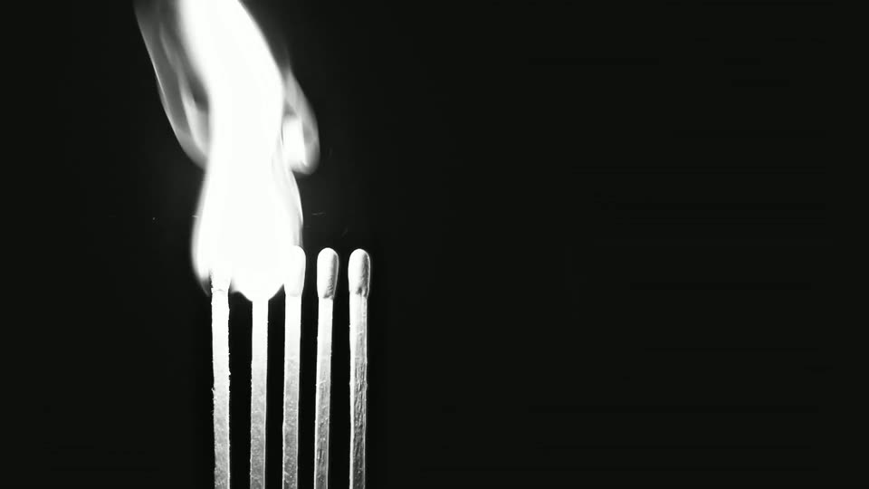
The frames carry no colour on purpose. That is not a stylistic choice made in the edit — it is what lets the page tint the footage at run time, so one 1.05 MB sequence serves every colourway a brand ever asks for. Switch the mode and the plate below and watch what each one actually does.
- What it is
- A single CSS property,
mix-blend-mode, on the layer holding the footage. The colour underneath is ordinary markup — solid blocks, no image, no export. - Why screen is correct here
- Screen never darkens, and pure black is its identity value: black leaves the plate exactly as it was. With white-on-black footage the background disappears completely and only the flame adds light — a free matte, with no alpha channel and no rotoscoping. Exclusion is what you reach for over a busy photo, because it inverts where the plate is bright, so the subject stays legible instead of blowing out to white in the light areas. Press “busy” above and compare the two.
- What it costs
- Nothing measurable. One property, composited on the GPU, no extra bytes. The cost is upstream: the footage has to be authored against black, which is a decision made when it was shot, not in the browser.
- When not to use it
- Over text. A blend mode composites against whatever happens to be behind it, and what is behind it changes the moment your copy reflows at a width you did not test. Also isolate it — a
mix-blend-modewith noisolation:isolateparent blends through the entire stacking context and will happily eat your header. This stage sets that isolation explicitly. - Payoff
- What this does for your customer: One piece of licensed footage can carry your brand colour instead of the stock colour it shipped with, so the site reads as built for you specifically — without paying for a new shoot every time the palette changes.
§ 03
SVG mask knockout
The word below is a window. An opaque panel covers the footage everywhere except inside the letterforms, so the flame reads through the type instead of behind it.
- What it is
- An SVG
<mask>holding a white rectangle and a black<use>. White keeps the covering panel; black punches it away. The panel is a flat fill of#0D1411, the same ink as the page, so the knockout reads as a hole rather than a box. - Why not export it flat
- Because a flattened SVG from a design tool is a picture of a word. Doing it in code keeps the type real: it reflows with the viewport, it re-renders crisply at any density, a crawler can read it, and changing the headline is a text edit rather than a round trip through the design file. The word exists as exactly one
<text>node — the mask points at it with<use>rather than repeating the string, so what a crawler reads and what you can select are the same node, and there is no second copy to fall out of sync. Try selecting across the word. - What it costs
- Measured rather than estimated, because “about 2 KB” is what this note said before anyone counted: 961 bytes of SVG exactly as it ships, comments and all — 636 with the explanatory comments stripped — plus 504 bytes across the five CSS rules that position it. 1,465 bytes in total, and no image request at all. It is one of the few genuinely free moves on this page.
- When not to use it
- When the word is long. A knockout headline is one line of type at display size; at four words it either shrinks below legibility or wraps, and a wrapped knockout looks like a rendering bug rather than a decision. Pick a word, not a sentence.
- Payoff
- What this does for your customer: The first word your customer reads is also the thing that catches their eye first — a live headline, not a picture of one, so it stays sharp on any screen and a search engine can still read it.
§ 04
Cursor-tracked 3D
A row of extruded fins standing on a shallow arc, each one capped with a lit edge. It leans toward the pointer and drifts on its own when the pointer goes away. Abstract on purpose — see the pipeline note further down for why we never model a client's actual product.
Static relief — the 3D library was not requested on this device.
- What it is
- three.js r128, self-hosted, no build step, no module graph. Two
InstancedMeshdraws — 46 extruded fins standing on a shallow arc, plus a lit cap on each, against a curved open cylinder. 92 boxes in three draw calls: two instanced, plus the backing arc. Rotation eases toward the pointer and falls back to a slow idle drift after 1.6 s of stillness. Rendering pauses entirely when the canvas scrolls out of view or the tab is hidden. - The trap everybody hits
- A metallic material with no environment map renders pure black, because metal has nothing to reflect. The usual fix ships an HDR file over the wire. This page builds the environment in-page instead: four coloured planes inside a box, run through
PMREMGenerator, zero bytes downloaded. The mean-luminance figure in the readout above is measured off the actual canvas pixels every couple of seconds — it is there so the claim “it is lit” is something you can check rather than something I asserted in a caption. - What it costs
- 603 KB raw — 603,445 bytes on disk — and 149 KB gzipped, for the library alone, before a single triangle. Then battery: a canvas that renders every frame keeps the GPU awake for as long as it is on screen. This one is capped near 40 fps and stops dead when it leaves the viewport, and it is never fetched on a phone.
- When not to use it
- As decoration. 149 KB gzipped is roughly the entire budget of a genuinely fast site, and spending it on ambience that a still image would have covered is the most common way a beautiful site becomes a slow one. If the 3D is not the point of the page, use a photograph.
- Payoff
- What this does for your customer: A hero section that feels responsive under the cursor on a capable laptop — and on a phone or an older device it quietly steps down to a still image instead of stuttering, so nobody gets a worse experience than the page can actually deliver.
§ 05
Scroll-pinned transition
One section holds still while the panel on top of it wipes away. Hand-rolled from position:sticky plus arithmetic — no animation library, because a library for this is 30 KB to avoid nine lines of maths.
Spend it on the one thing.
Underneath is where the message goes. By the time the visitor reaches it they have committed a full screen of scroll to getting here, so it had better be the sentence that matters, not a sub-heading.
Pinning buys you one moment.
The page stops. Attention narrows to a single rectangle. It is the most expensive thing you can do to a visitor's scroll, which is exactly why it works — and exactly why it only works once.
- What it is
- A tall track with a sticky child. Scroll progress through the track is normalised to 0–1 and driven straight into a
clip-path: inset()on the upper panel. Everything runs inside the samerequestAnimationFrameloop as the rest of the page, so there is one ticker, not six. - What it costs
- Almost no bytes. It costs the visitor's scroll instead, which is the more expensive currency: for the height of the track, the page is not going anywhere and they cannot make it.
- When not to use it
- More than once per page. Two pinned sections in a row and a visitor concludes the page is broken and leaves — and they are not wrong, because from their side a scroll that does not scroll is a bug. Then this page pins twice, so the rule is one you can watch me break: specimen 01 sticks its stage inside a 340 vh track, and this one sticks its panels inside a 230 vh track. 5.7 screens of page height between them, 3.7 of which are spent standing still. A lab that demonstrates pinning has to pin, and a page selling something does not — on a client build I would ship one of these or neither, and the claim above is the rule, not a description of this file. Below 820 px both pins are dropped entirely and the panels stack, which is also what happens under reduced-motion.
- Payoff
- What this does for your customer: Their attention gets held on the one sentence you most need them to read, for exactly as long as it takes to read it — then the page lets go and gives the scrollbar back.
§ 06
Reveal choreography and magnetic hover
The quiet one. Almost every section on this page arrives with a staggered fade, and you probably did not notice — which is the entire brief. Press replay to watch it happen on purpose.
- 01Threshold. An IntersectionObserver fires at 18 % visibility, not on scroll position — no listener, no layout thrash.
- 02Duration. 340 ms. Past roughly 400 ms a reveal stops reading as arrival and starts reading as lag.
- 03Stagger. 60 ms per item, capped, so the last row of a long list is not still waiting when the eye gets there.
- 04Distance. 16 px of travel. Anything further and the text is visibly sliding rather than settling.
- 05Stall guard. At 1.4 s a timer checks one flag — has the observer delivered a single entry yet. Only if it has not does everything still hidden appear at once. If the observer is working, the timer does nothing.
- 06Opt out. Under
prefers-reduced-motionthe whole system is inert and everything is simply present.
- The stall guard
- IntersectionObserver does not fire in every context — some in-app browsers, some print paths, some restored bfcache states. If your content only becomes visible when the observer fires, then in those contexts your content never becomes visible. So a 1.4 s timer reads one flag — did the observer ever deliver an entry — and reveals everything only if it did not. One line, and it turns a catastrophic failure into a missed animation. It has to be that flag rather than a bare timer: an unconditional version also fires on a page where nothing is wrong, and 1.4 s after load it would flatten the reveal on everything still below the fold, which here is most of the page — including the one specimen whose entire job is to show you the choreography.
- Magnetic hover, and the bug in it
- The button leans toward the cursor by up to 9 px across and 6 px down, easing back on exit. The trap: reveals animate
transform, and magnetic hover animatestransform. Put both on the same node and whichever runs second silently erases the other — a nav centred withtranslateX(-50%)will fly off screen the instant it reveals. Here the reveal is on an outer wrapper and the magnetism is on the button inside it. Ask me how I know. - What it costs
- Measured, because “about a kilobyte” is what this note claimed until someone counted it. The reveal engine and its stall guard are 2,262 bytes of script exactly as shipped — 1,499 with the explanatory comments stripped — plus 190 bytes of CSS for the two
[data-reveal]rules. Magnetic hover adds 1,053 bytes. 3,315 bytes for both, and no bytes of library. The replay button costs a further 1,259 and does not count, because it is a demonstration control that exists only on this page. Magnetic hover is disabled outright on touch, where there is no cursor to lean toward and the effect only ever fires as a confusing jump on tap. - When not to use it
- On anything the visitor came for. A reveal on a phone number is a phone number that is not there yet. Reveals belong on supporting material, never on the price, the address, the hours or the button.
- Payoff
- What this does for your customer: The page feels calm and considered as they scroll through it, without a single animation ever standing between a visitor and your price, phone number, hours, or booking button.
How these get made
Nothing on this page came out of a prompt. Here is the actual chain, because the chain is the part you are hiring.
The sequence
The burn footage is licensed stock — real film of matches being struck, lit against black. This studio does not shoot its own footage, here or on client work: every clip and every photograph is licensed, supplied by the client, or plainly labelled as generated.
It is cut to the arc that reads — ignition, flare, collapse to embers — then conformed to exactly ninety frames, because ninety is what a comfortable scroll distance holds at one frame per few pixels. Measured off the files rather than asserted, mean luma runs 8.8 at frame 001 and 39.0 at 004, peaks at 58.2 at frame 008 — the brightest of all ninety — then falls away through 34.1, 26.9, 20.9 and 17.7 at frames 012, 030, 045 and 060 to 16.4 at 090. Three acts, and ffprobe signalstats will hand you every one of those numbers. From there it is one command:
Two corrections have been made to that command, both on the one page that has no business being wrong about a number. The first is the cut. An earlier extraction started at 0.8 s, which puts the in-point after the strike: it peaked at frame 002 and did nothing but decay for the remaining 88, so there was no ignition in it anywhere — while this copy sat above it claiming a three-act arc. The command above is the re-cut that actually contains one, and the luma figures in the paragraph above are measured off its output. The second is the pixel format: an earlier draft called these frames single-channel grayscale. So, corrected: this ffmpeg build cannot write a single-channel JPEG at all. Its mjpeg encoder accepts six pixel formats and every one of them carries three components. Ask for -pix_fmt gray and it tells you so, then quietly substitutes 4:4:4 — the most expensive layout of the three.
The weight saving is real; it just comes from somewhere else. format=gray in the filter chain flattens the colour, so both chroma planes arrive constant — measured at 127 in all ninety frames. Constant planes are nearly free to subsample, so asking for 4:2:0 explicitly takes the sequence from 1,325,267 bytes to 1,049,581: 1.33 MB down to 1.05 MB, 20.8 % off, with the picture bit-for-bit identical. Run both encodes through ffmpeg’s psnr filter and the luma channel reports inf, because there is no difference to report.
Desaturating is a production decision, not a look. It is what lets specimen 02 tint the footage at run time — one sequence, every colourway the brand will ever ask for.
The 3D
Specimen 04 is geometry generated in the browser from a wave function — ninety-two boxes on an arc and one curved panel, lit by an environment built out of four coloured planes. There is no model file, no scan, no asset library, and nothing in it is pretending to be a photograph of anything.
That is deliberate, and it is a line we hold on client work.
Where generated imagery is allowed
Generated 3D and generated imagery are used for abstract or atmospheric moments only — texture, light, motion, a shape that is obviously a shape. They are never used to depict a client's actual product, premises, staff, food or work.
If the photograph does not exist, we do not invent a convincing one. We design around the absence — with type, colour, structure and blank space — and we say plainly that a shoot is the thing that would fix it. A generated photo of a restaurant that is not your restaurant is not a placeholder. It is a claim, and it is the customer who finds out it was false.
Four tells of a generated website
Useful whether or not you hire me. These four turn up together, they turn up constantly, and once you can see them you cannot stop.
-
01
An identical letter-spaced eyebrow above every section
A person writes an eyebrow when a section needs an index or a category. A model writes one because the previous section had one. The tell is not the label — it is the perfect uniformity of it, twelve sections deep.
-
02
Pastel gradient-mesh clouds behind everything
It is the cheapest available way to make an undesigned area look considered, so it lands wherever nothing was actually decided. Real layouts earn their empty space and are willing to leave it empty.
-
03
The default purple-to-teal palette
Nobody's brand is purple-to-teal. It is the fallback of every image model and every starter template, which means its presence is direct evidence that no colour decision was ever made about this business.
-
04
Three gradient-filled feature cards in a row
Three is the number a model reaches for when it does not know how many things there are. Real offerings are rarely exactly three and are almost never equally important — and a layout that makes them look equal is telling you it did not read the business.
For the record, held against its own list: this page uses a mono index label on the six specimens and nowhere else, because there it carries a number. There was a seventh sitting above the headline — same font, same letter-spacing, same acid green, carrying no number and no information — and it was this paragraph that convicted it. It has been deleted rather than explained away. There is no gradient fill anywhere in its stylesheet — every colour on it is a flat block. And the honest notes under each specimen are a two-column definition list, not a card grid, because there are three to five of them depending on the specimen and they are not equal.